Layout & patterns
These are the structural conventions of the theme. Follow them for every page, section, dialog and list, and the app stays consistent on its own; you never design a one-off layout per screen.
What is the standard page template?
Every page is a full-height flex column. The title moves up to the global top bar, an action header holds the breadcrumbs and any page actions, and the content scrolls below it with p-4 padding. Only that content region scrolls; the header and the app footer stay fixed.
"use client";

import { RocketIcon } from "@radix-ui/react-icons";
import { Breadcrumbs } from "@/app/_components/breadcrumbs";
import { SetPageTitle } from "@/app/_components/set-page-title";

export default function MyPage() {
  return (
    <div className="flex h-full flex-col">
      {/* 1: surfaces the title + icon in the global top bar */}
      <SetPageTitle title="My page" icon={RocketIcon} />

      {/* 2 - action header: breadcrumbs (left) + optional actions (right) */}
      <div className="flex h-12 shrink-0 items-center justify-between gap-3 border-b border-border px-4">
        <Breadcrumbs />
        {/* <Button variant="primary">…</Button> */}
      </div>

      {/* 3: the only scrolling region; p-4 + gap-4 between sections */}
      <div className="min-h-0 flex-1 overflow-y-auto">
        <div className="flex flex-col gap-4 p-4">
          {/* sections go here */}
        </div>
      </div>
    </div>
  );
}
Consistent padding
p-4 with gap-4 between sections. Home, Settings, Charts, Forms, and every datatable page share this exact frame, and yours should as well.Architecture: three layers
Data-backed pages are split into three files so no data processing ever happens in a UI component. Data flows one way: Data → Controller → Presentation. The organizations page is the reference. Copy its shape.
- Data (API):
lib/api/<entity>.ts. Async functions that talk to the backend; no React. It's a mock in-memory table today, but the signatures are the real-API seam: swap each body forfetch(url, { signal })and nothing above changes. - Controller:
app/(app)/<route>/use-<entity>.ts. A hook that owns{ data, loading, error }, calls the data layer after mount, and exposes writes. No JSX. - Presentation: a thin
*-table.tsxthatnext/dynamic-loads the view behind a skeleton, and a*-view.tsxthat reads the controller and rendersRecordView. Zero fetching or data processing.
loading: true with no rows, so the skeleton shows the moment you click; the dynamic import means the shell renders before the heavier datatable chunk parses. For large server-backed lists, reach for RecordView's built-in fetcher instead of wiring pagination by hand.// lib/api/organizations.ts: DATA (no React; swap body for fetch())
export async function listOrganizations(signal?: AbortSignal) {
const res = await fetch("/api/organizations", { signal });
return res.json();
}
// use-organizations.ts: CONTROLLER (loads after mount)
export function useOrganizations() {
const [data, setData] = useState([]);
const [loading, setLoading] = useState(true);
useEffect(() => {
const c = new AbortController();
listOrganizations(c.signal).then((rows) => { setData(rows); setLoading(false); });
return () => c.abort();
}, []);
return { data, loading, save: replaceOrganizations };
}
// organizations-table.tsx: PRESENTATION (paint shell first)
const View = dynamic(() => import("./organizations-view").then((m) => m.OrganizationsView),
{ ssr: false, loading: () => <TableSkeleton /> });
// organizations-view.tsx: PRESENTATION (no data work)
const { data, loading, save } = useOrganizations();
<RecordView data={data} loading={loading} onDataChange={save} … />Page types
Every page shares the frame above; only the content region changes. The theme gives you five page types. When you add a page, decide which one the requirement calls for and fill in its content. Don't invent a sixth shape.
1 · Data table page
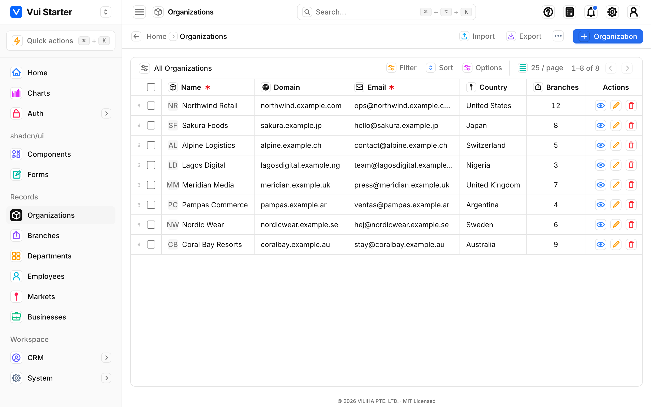
Use this for any list of records: Organizations, Branches, Departments, Employees, Markets, and the System and CRM lists. The route is a thin server page.tsx that renders a client *-table.tsx, and that file is a single RecordView fed a fields array. RecordView brings its own action header, breadcrumbs, padded card, sorting, filtering, pagination, row actions, the add/edit form and import/export. You configure it rather than lay it out. Every data table page runs on this one layout; only the fields config changes.
// page.tsx - server component: metadata + the table, nothing else
export const metadata = pageMeta("/departments");
export default function DepartmentsPage() {
  return <main className="h-full"><DepartmentsTable /></main>;
}

// departments-table.tsx: "use client"
<RecordView
  title="Departments" singular="Department" icon={LayoutGrid}
  fields={fields}                       // the whole design comes from here
  initialData={departments}
  getPrimary={(row) => ({ title: row.name, initials: "…" })}
  makeEmptyRow={() => ({ /* blank row */ })}
/>
See the Data table page for the full fields reference.
2 · Record form: Add / Edit / View
The Add, Edit and View screens for a record are one form, rendered by RecordView/RecordForm from the same fields array: View is the read-only state, Edit the editable one, and Add is the same form on a blank row. You never build three separate forms. It comes in two variants, and that choice is the whole difference between Branches and Organizations:
- Slide-over overlay (default): Branches, Departments. Render
<RecordView>with noformModeand Add/Edit/View open in a right-hand panel over the table. It's uncontrolled; you passinitialData. Reach for it on short forms and quick edits. - Full-page routes: Organizations. Set
formMode="page"and route the actions to dedicated URLs (/new,/edit). The form then takes over the whole page with a breadcrumb bar, an optional documentation panel, and a fixed Save/Cancel footer. It's controlled: the table and the routes share one data source and one*-config.tsx. Use it for long forms, or whenever the form needs its own URL.
// Branches: overlay, uncontrolled. That's the whole difference.
<RecordView title="Branches" fields={fields} initialData={branches} … />

// Organizations: full-page routes, controlled via a controller hook that
// loads from the data layer (data → controller → presentation; see /docs/layout).
const { data, loading, save } = useOrganizations();
<RecordView
  formMode="page" formColumns={1}
  fields={fields} data={data} loading={loading} onDataChange={save}
  onCreate={() => router.push("/organizations/new")}
  onView={(id) => router.push(`/organizations/edit?id=${id}`)}
  onEdit={(id) => router.push(`/organizations/edit?id=${id}`)}
  … />

// /organizations/new/page.tsx renders the exported RecordForm directly,
// using the same fields from organizations-config.tsx.
<RecordForm isNew fields={fields} row={draft} onSave={…} onCancel={…} />
The footer and the body are configurable
formActions={(defaults) => [...defaults, archive]} adds a button, an array replaces them, and renderFooter replaces the footer outright. Between the fields, formSlots drops in your own content as a full-width row inside a section, and fullWidth on a field gives it the whole row with its label above. Both variants get all of it, since they are the same component. Details on the Data table page.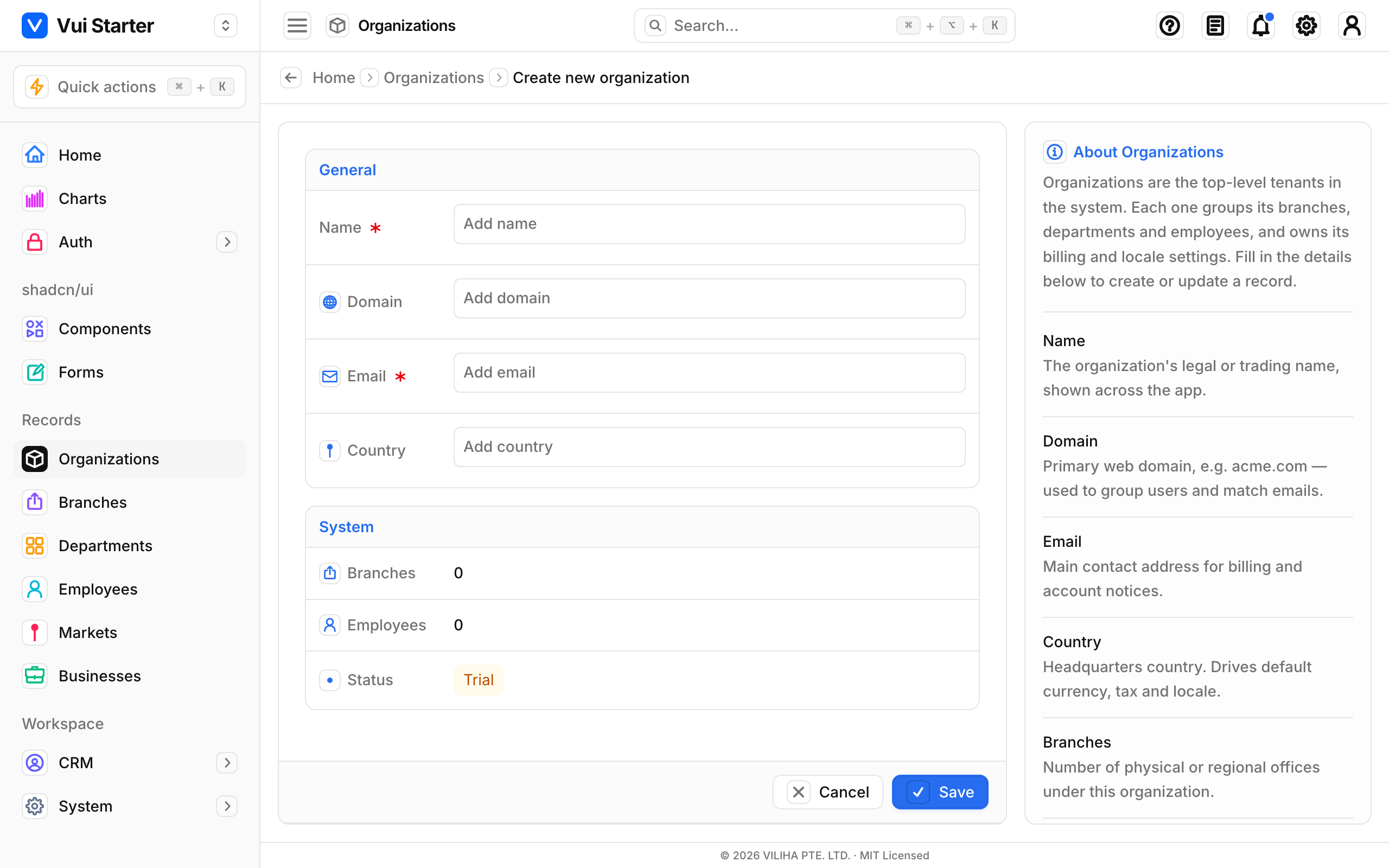
The Info panel beside the form is dynamic. Nothing in it is hardcoded. It reads from the same config as the form: formDescriptionfills the "About" intro, and each field with a description adds a labelled help entry. Provide those in your requirement and the panel writes itself; leave them out and it disappears, giving you a full-width form. (It appears on lg screens and up.)
<RecordForm
  formMode="page"
  formDescription="Organizations are the top-level tenants…"   // → the "About" intro
  fields={[
    { key: "name", label: "Name", required: true,
      description: "The legal or trading name, shown across the app." }, // → a help entry
    { key: "code", label: "Code" },   // no description → not shown in the panel
  ]}
/>
The slide-over variant renders the same fields in a right-hand panel over the table (see the "Form: slide-over" thumbnail above). It has no Info panel, so switch to full-page mode whenever you want the help column.
3 · Dashboard page
An overview screen: the Home page at /dashboard. A row of StatCards sits at the top, followed by a grid of bordered-card sections holding tables, progress bars and lists. It uses the standard scrolling content region: the stat grid first, then a responsive grid of sections below it.
<div className="min-h-0 flex-1 overflow-y-auto">
  <div className="flex flex-col gap-4 p-4">
    <section className="grid grid-cols-2 gap-4 lg:grid-cols-4">
      {/* <StatCard /> × 4 */}
    </section>
    <div className="grid grid-cols-1 gap-4 lg:grid-cols-3">
      {/* bordered-card sections: a wide table + a side column */}
    </div>
  </div>
</div>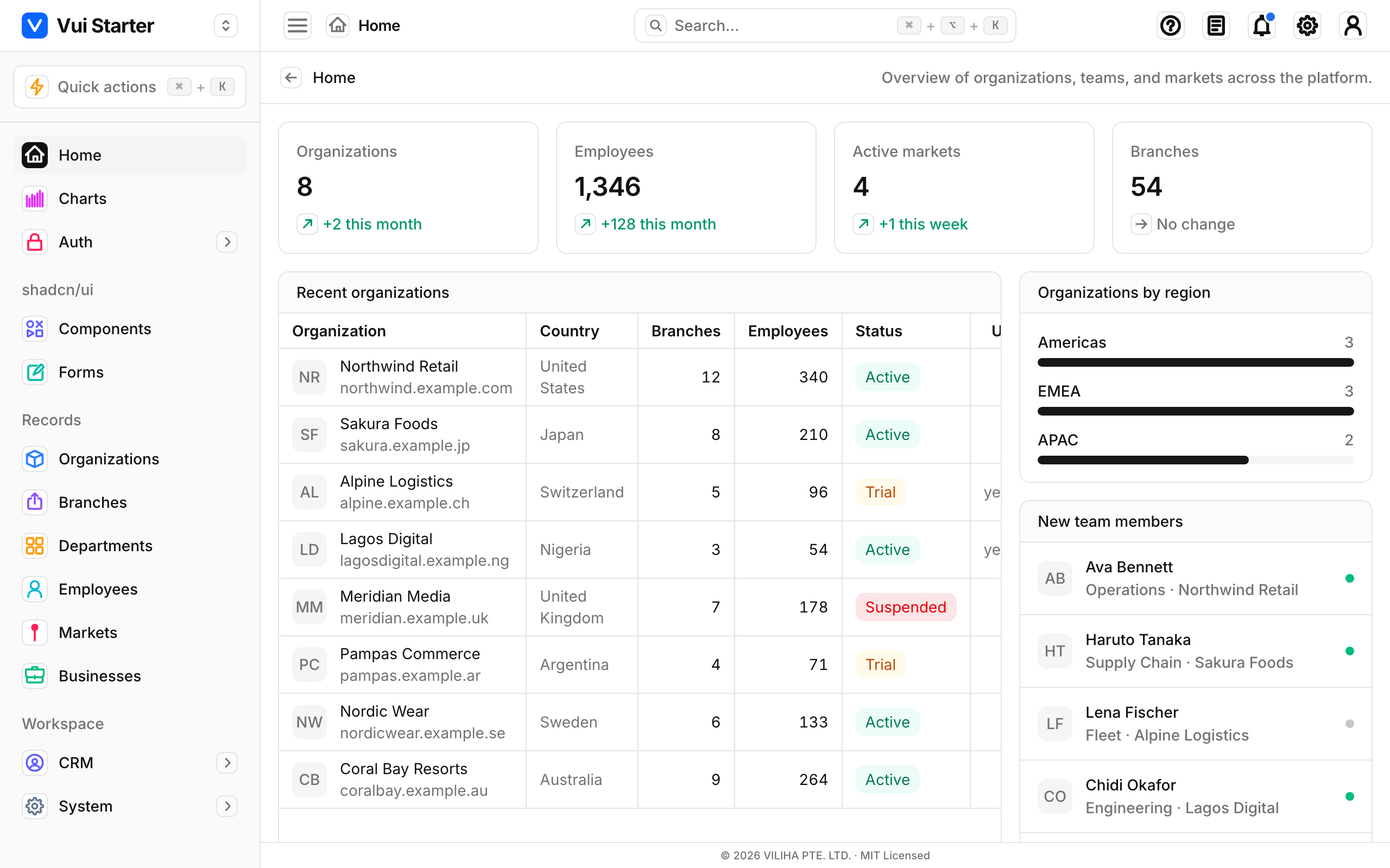
4 · Settings (single-form) page
One long form on its own page: Settings. Rather than a scrolling column of sections, the content is a single bordered card: it holds scrollable Section cards, with a fixed footer action bar(Save) pinned to the bottom, the same footer the full-page record form uses. Reach for this whenever a page is "a form with a Save button," not a list.
<div className="min-h-0 flex-1 overflow-hidden p-4">
  <div className="flex h-full flex-col overflow-hidden rounded-lg border border-border bg-card">
    <div className="min-h-0 flex-1 overflow-y-auto p-4 md:p-6">
      {/* <Section title="Profile"> … </Section> cards */}
    </div>
    {/* fixed footer: matches the record form's action bar */}
    <div className="flex shrink-0 items-center justify-end gap-2 border-y border-border bg-muted/40 px-4 py-3">
      <Button variant="primary">Save changes</Button>
    </div>
  </div>
</div>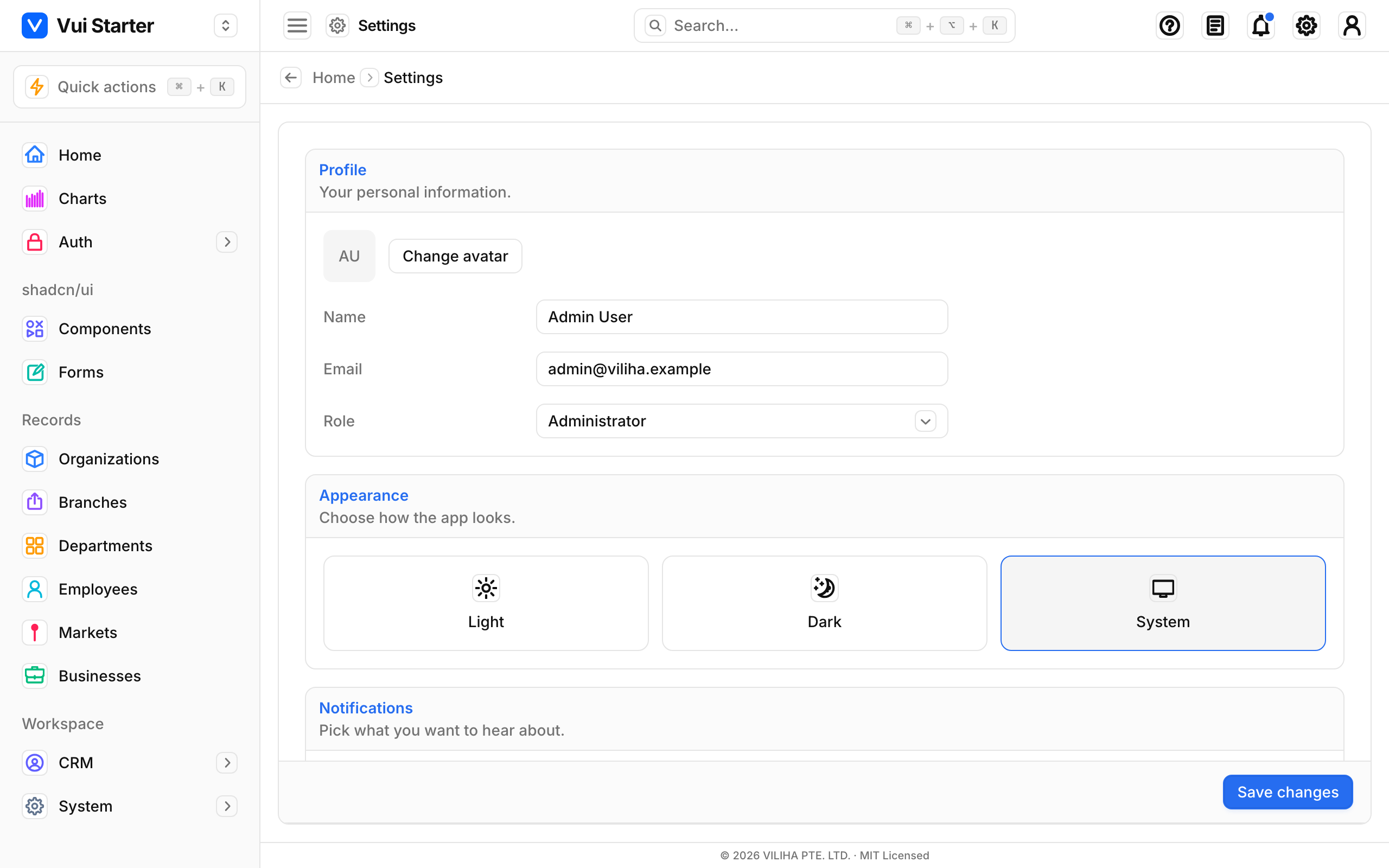
5 · Board (Kanban) page
A horizontally scrolling column board: the Opportunities pipeline. The content region scrolls on the x axis and holds fixed-width (w-72) columns, each a dashed, droppable card list you can drag cards between. Use it for stage or status pipelines; flat lists belong in a data table.
<div className="min-h-0 flex-1 overflow-x-auto p-4">
  <div className="flex h-full gap-4">
    {stages.map((stage) => (
      <section key={stage} className="flex h-full w-72 shrink-0 flex-col gap-3">
        {/* column header + count */}
        <div className="flex min-h-0 flex-1 flex-col gap-2 overflow-y-auto rounded-lg border border-dashed border-border bg-muted/30 p-2">
          {/* draggable cards */}
        </div>
      </section>
    ))}
  </div>
</div>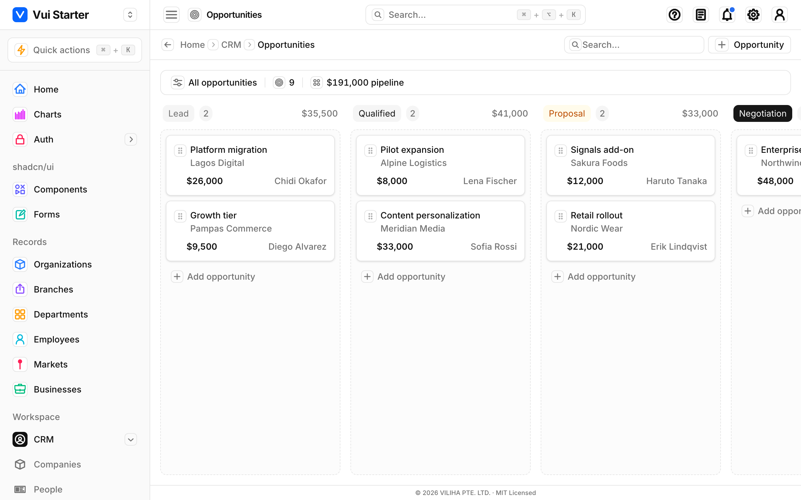
Client pages need a layout.tsx for metadata
"use client"), so they can't export const metadata. Add a small sibling layout.tsx that exports metadata = pageMeta("/route") and returns its children, as Dashboard and Settings both do. Data table pages keep their server page.tsx, so they export metadata directly.Sections
A section is a bordered, rounded card: a muted header bar with a bottom border, then the content. Stack them in the gap-4 column and they space themselves.
<section className="overflow-hidden rounded-lg border border-border bg-card">
  <div className="border-b border-border bg-muted/40 px-4 py-2.5">
    <h2 className="font-medium">Section title</h2>
  </div>
  <div className="p-4">
    {/* content */}
  </div>
</section>
Breadcrumbs
Drop <Breadcrumbs /> into the action header, which is where it belongs. It renders the back button and derives the trail from the current route automatically, so you never build a trail by hand.
- The trail comes from the pathname and the nav config (
nav-config.ts), so labels stay in sync with the sidebar. It's always rooted at Home, the single landing page at/dashboard, and the last crumb is the current page (non-interactive). - Group parents resolve automatically. A section with no index page (say
/crm) links to its first child (/crm/companies) instead of 404-ing. That too comes from the nav config, with no per-page wiring.
Datatable pages
RecordView renders its own action header and picks up the breadcrumbs through context, so a datatable page is just <RecordView … />. The header, breadcrumbs and padded card all come for free.Command palette: Quick actions & Global search
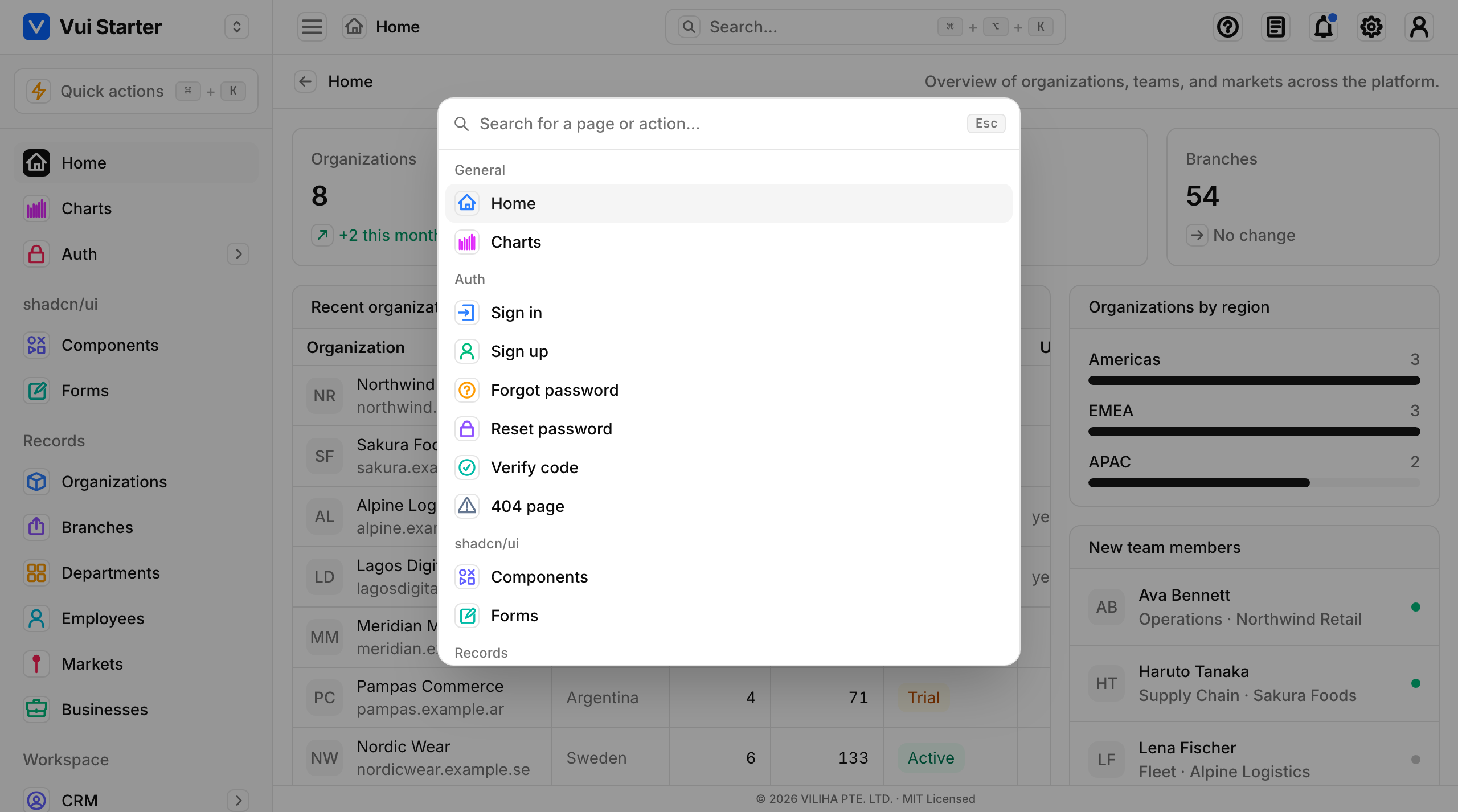
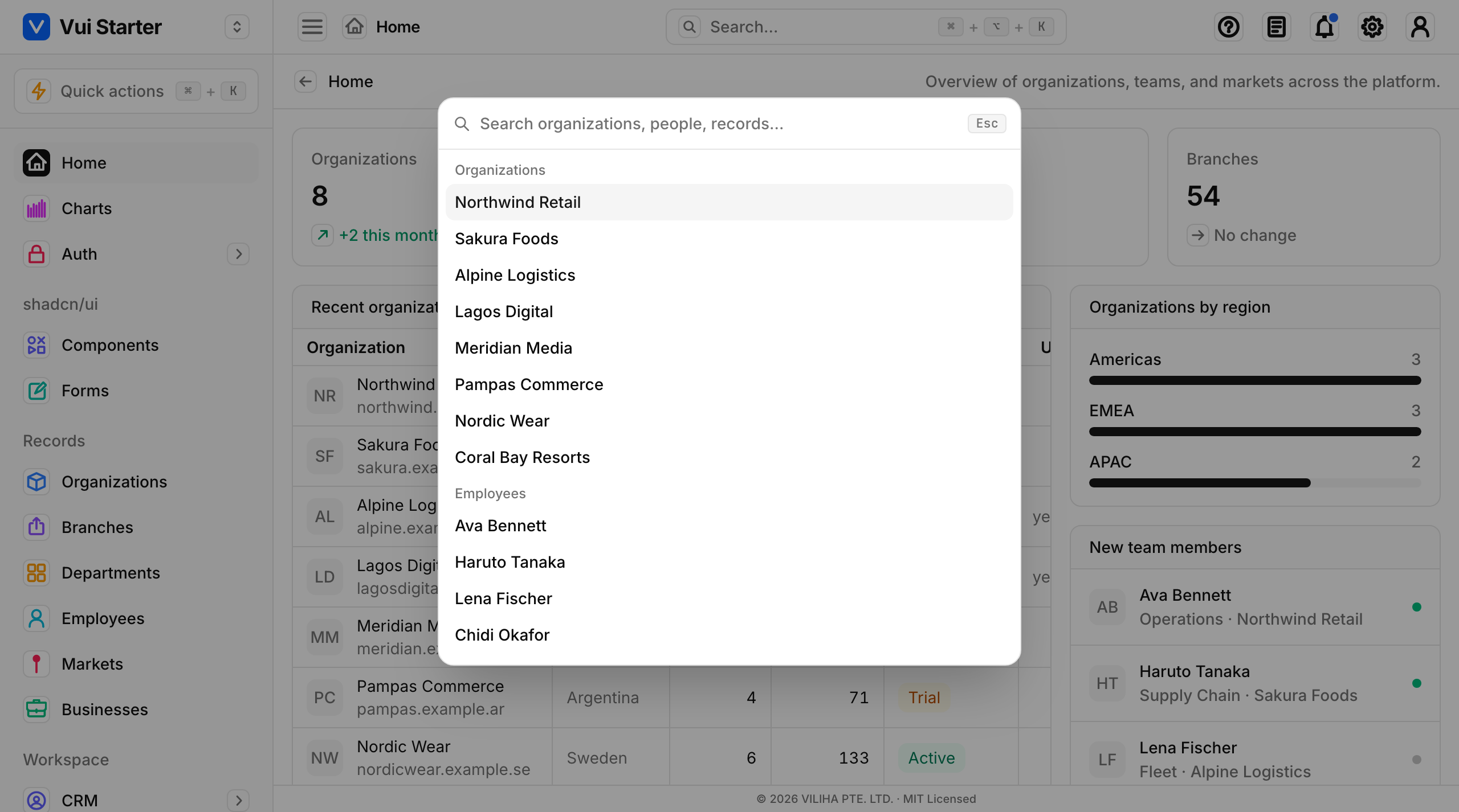
Two ⌘K-style palettes ship in the shell, both built on the same headless CommandPalette from @viliha/vui-react. The only difference between them is what they search:
- Quick actions (
⌘K, or/when you're not typing) jumps between pages. It opens from the sidebar button, and its actions come fromnav-config.ts, so a new page shows up on its own. - Global search (
⌘⌥K) searches records: organizations, people, opportunities, reference data. It opens from the top-bar search box, and each result navigates to where the record lives.
How to implement one
CommandPalette is headless and router-agnostic: you own the open state and pass an actions array, where each action carries its own onSelect. A small provider holds the open state, wires the global shortcut, and mounts the palette once. Start from app/_components/quick-actions.tsx (pages) or global-search.tsx (records).
"use client";
import { useState, useEffect, useMemo } from "react";
import { useRouter } from "next/navigation";
import { CommandPalette, type CommandAction } from "@viliha/vui-react/command-palette";

export function SearchProvider({ children }: { children: React.ReactNode }) {
  const [open, setOpen] = useState(false);
  const router = useRouter();

  // Global shortcut: ⌘K here; use e.altKey to tell ⌘K from ⌘⌥K.
  useEffect(() => {
    const onKey = (e: KeyboardEvent) => {
      if ((e.metaKey || e.ctrlKey) && !e.altKey && e.code === "KeyK") {
        e.preventDefault();
        setOpen((v) => !v);
      }
    };
    window.addEventListener("keydown", onKey);
    return () => window.removeEventListener("keydown", onKey);
  }, []);

  // Build actions from anything: NAV pages, or records from your API.
  const actions: CommandAction[] = useMemo(
    () => [
      { id: "orgs", label: "Organizations", group: "Go to",
        onSelect: () => router.push("/organizations") },
      // …one entry per page (Quick actions) or per record (Global search)
    ],
    [router],
  );

  return (
    <>
      {children}
      <CommandPalette open={open} onClose={() => setOpen(false)} actions={actions} />
    </>
  );
}
Each CommandAction is { id, label, group?, icon?, keywords?, onSelect }: group renders a heading, keywords widen the match, and onSelectdoes the work. Global search's record index is the demo's stand-in for a backend. Swap it for your API results and everything else stays the same.
Two shortcuts, no clash
⌘K opens Quick actions, ⌘⌥K opens Global search, and /opens Quick actions when you aren't typing in a field. Each provider registers its own shortcut, and e.altKey tells the two apart.Top bar features (configurable)
Every top-bar affordance (Quick actions, Global search, Help, Documentation, Notifications, Settings and the User menu) is on by default, and a consumer can turn any of them off. Flags live in lib/app-config.ts; there are two ways to set them:
- Install-time: set the matching
NEXT_PUBLIC_SHOW_*env var to0(baked into the build; the default for everyone). - Runtime: flip it on the Settings page (Top bar section); the choice persists per-browser and overrides the install-time default live, no rebuild.
NEXT_PUBLIC_SHOW_HELP=0
NEXT_PUBLIC_SHOW_NOTIFICATIONS=0
Turning a feature off doesn't just hide the icon; it also drops the keyboard shortcut (e.g. disabling Quick actions removes ⌘K) and skips mounting its palette. Read the effective flags anywhere with useChrome() (_components/chrome-config.tsx).
Settings stays reachable
/settings (and in the user menu), so you can always get back to re-enable a feature or Reset to defaults.Open tabs
⚠️ Not in the current download
The shell keeps a browser-style strip of the pages you've opened under the top bar (labelled Tabs), so several pages stay one click apart. Navigating opens a tab or focuses an existing one; ⌘/Ctrl-clicking a sidebar item opens it in a background tab without leaving the current page; and the ✕ closes one. You can drag tabs to reorder them (each shows a grip handle and the shift animates via FLIP) and right-click to tag one with any of seven color labels. The open list, its order and the colors all persist across reloads via sessionStorage, capped by NEXT_PUBLIC_MAX_TABS (default 5; opening more evicts the oldest and warns).
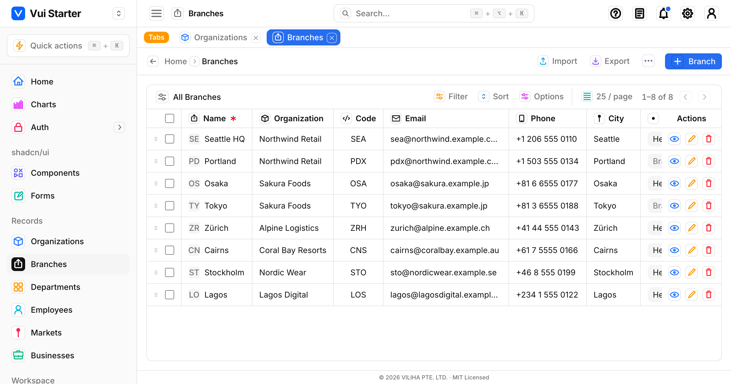
It's OpenTabsProvider + <TabStrip /> + <KeepAliveTabs />, mounted once in (app)/layout.tsx, and it's keep-alive: every open page stays mounted with the inactive ones hidden. Switching tabs is therefore instant: no remount, no flash, and each page holds its live state (scroll, inputs, in-progress work). New menu items mount on first visit. Tab labels, icons and colors derive from the same nav-config.ts / route-meta.tssource as the sidebar, so a new page is tab-able with no extra wiring. For a custom "open in new tab" button, call useOpenTabs().openTab(href, { background: true }).
Why keep-alive here
MAX_TABS cap bounds how many stay mounted at once.Turn keep-alive off
NEXT_PUBLIC_KEEP_ALIVE_TABS=0 to disable it while the feature is being stabilised. Pages then remount on navigation (no cached instances, no preserved state), and the tab strip stays as a plain navigation shortcut.Stale data in a kept-alive tab
useRefetchOnActive(routePath, refetch) (lib/use-refetch-on-active.ts), which runs your refetch when the tab becomes active again or the window regains focus. Make that refetch a delta (?since=cursor) that returns only the changed rows + deleted ids and merges them by id, not a full reload. use-organizations.ts + syncOrganizations()are the reference. Refetch narrows the conflict window but can't close it: guard the write itself with optimistic concurrency (send the record's version/updatedAt, reject a stale write with 409).Multi-step wizard
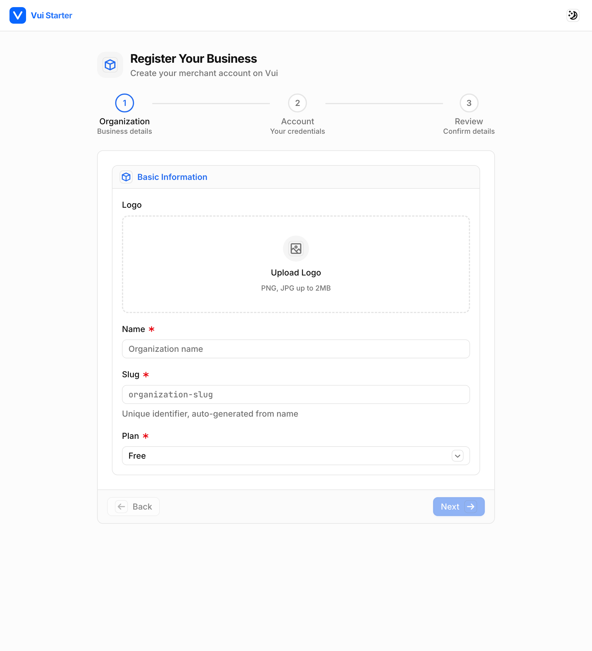
For a guided flow (registration, onboarding, checkout), pair the exported Steps indicator with your own step state. Stepsis controlled and presentational: you pass the steps and the current index, and it renders the state: completed steps fill with the primary color and a check, the current one is ringed, and upcoming ones stay muted. Build each step's body from the usual primitives (Input, Select, the shared Field) inside a section card, with a Back/Next footer. See the live demo at /register-business.
import { Steps, type Step } from "@viliha/vui-react/steps";

const STEPS: Step[] = [
  { label: "Organization", description: "Business details" },
  { label: "Account", description: "Your credentials" },
  { label: "Review", description: "Confirm details" },
];

function Wizard() {
  const [step, setStep] = useState(0);
  return (
    <>
      <Steps steps={STEPS} current={step} />
      {step === 0 && <OrganizationFields />}
      {/* … */}
      <div className="flex justify-between border-t border-border bg-muted/40 px-4 py-3">
        <Button onClick={() => setStep((s) => s - 1)} disabled={step === 0}>Back</Button>
        <Button variant="primary" onClick={() => setStep((s) => s + 1)}>Next</Button>
      </div>
    </>
  );
}
See the workflow requirement template for how to brief an agent to build one of these.
Bordered list components
Any component that renders a list of records (dropdown menus, selects, the account menu, searchable comboboxes) uses bottom-border dividers between items by default. Instead of memorizing the classes, build lists from the Menu primitive: it bakes in the divider, hover and last-row handling, so a hand-rolled list can't miss the border.
import { Menu, MenuItem, MenuLabel } from "@viliha/vui-react/menu";

<Menu className="w-56">
  <MenuLabel>Account</MenuLabel>
  <MenuItem onClick={editProfile}>Profile</MenuItem>
  {/* render a link instead of a button with `as` */}
  <MenuItem as={Link} href="/settings">Settings</MenuItem>
  <MenuItem onClick={signOut}>Sign out</MenuItem>
</Menu>
The shipped Dropdown, Select and account menu already follow this, so you get it for free by using them. If you need the raw class for a bespoke element, import menuItemClass from @viliha/vui-react/menu.
Dialogs
Dialogs are sectioned like everything else: a bordered header, a scrollable body, and a bordered footer for actions. The Dialog primitive gives you the shell (centered panel, dimmed backdrop, entrance animation, Escape and backdrop-click to close) along with those three placeholders, so all you supply is content.
import {
  Dialog, DialogHeader, DialogTitle, DialogBody, DialogFooter,
} from "@viliha/vui-react/dialog";
import { Button } from "@viliha/vui-react/button";

<Dialog open={open} onClose={close} label="Invite teammate">
  <DialogHeader>
    <DialogTitle>Invite teammate</DialogTitle>
  </DialogHeader>
  <DialogBody>
    {/* your form / content */}
  </DialogBody>
  <DialogFooter>
    <Button onClick={close}>Cancel</Button>
    <Button variant="primary" onClick={submit}>Send invite</Button>
  </DialogFooter>
</Dialog>
Confirmations
For a yes/no prompt such as a delete, ConfirmDialog is built on Dialog; pass it a title, a description and the handlers:
import { ConfirmDialog } from "@viliha/vui-react/confirm-dialog";

<ConfirmDialog
  open={open}
  title="Delete organization?"
  description="This can't be undone."
  destructive
  confirmLabel="Delete"
  onConfirm={remove}
  onCancel={close}
/>